

Project Management | PMP Exam Prep
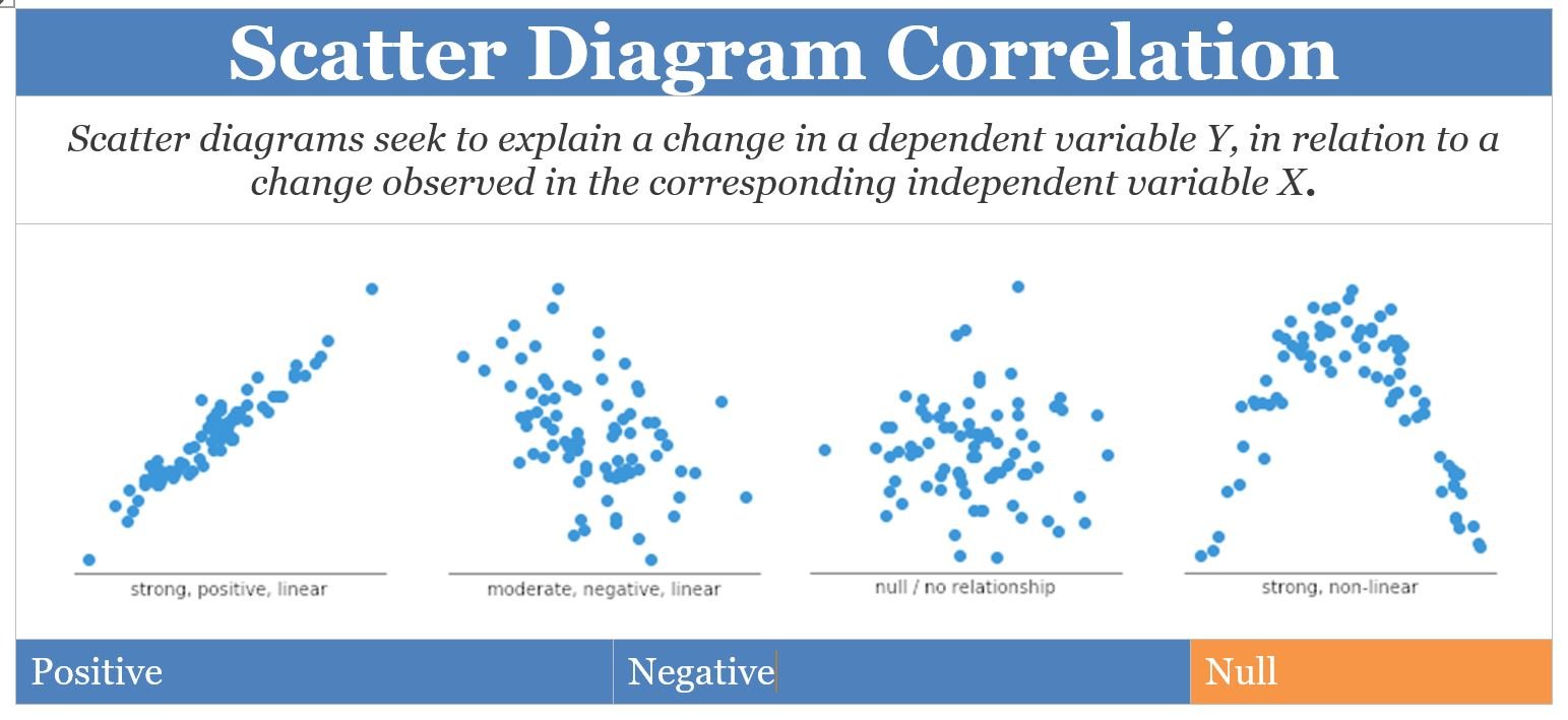
To understand the impact of a scatter diagram, it is important to know the correlation between the data sets has the most meaning. Also, knowing how the data correlates aids with determining the type of scatter diagram. When preparing for the PMP exam, project managers should know the three categories of scatter diagrams based on correlation:
- Scatter Diagram with No Correlation
- Scatter Diagram with Moderate Correlation
- Scatter Diagram with Strong Correlation
In plotting figures from specific quality metrics, the project manager will graph ordered pairs on the X,Y axis. Listing data in a table will not have the same impact as visually showing it on a graph; PMP credential holders know when measuring variables, it is not only the accuracy of the data which matters, but how it is communicated. Scatter diagrams are a tool to assess and communicate quality control.
Scatter Diagram Correlations
If a relationship is found between the two variables, it is called a “correlation,” A regression line can be used “to estimate how a change to an independent variable will influence the value of the dependent variable.” A correlation may be identified when there is a cause and effect relationship between two parameters. The direction of the correlation on the graph indicates the type of scatter diagram and the type of relationship between variables.
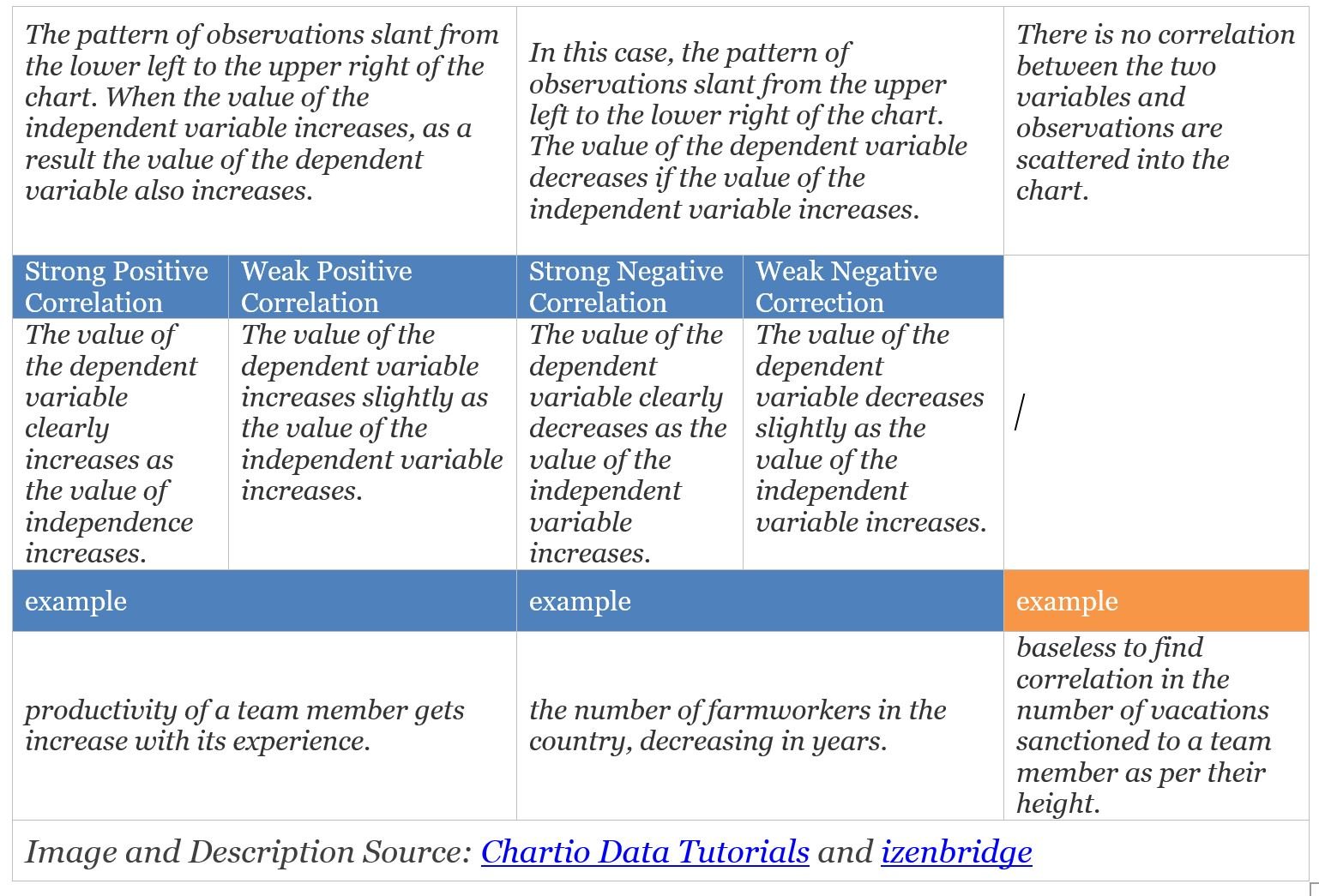
A key aspect of understanding correlation says just because a relationship exists between two variables does not automatically mean there is causality. The phrase “correlation does not imply causation” should be known by any project manager and PMP credential holder who uses scatter diagrams. The observed relationship could be:
- driven by a third variable, or
- reversed by the causal link, or
- simply coincidental.
Creating the scatter diagram is part of the PMP holder’s work, but when the graph has been completed, it does not mean the work is done. The analysis of the graph, identifying any potential correlations, and determining the connections to quality are what brings the value to the scatter diagram tool.
Scatter Diagram Uses
Determining a correlation between variables can enable better decisions for the project. The American Society for Quality (ASQ) provides these potential uses for the scatter diagram when determining if two variables are related:
- to identify potential root causes of problems,
- to determine objectively whether a particular cause and effect are related, or
- to determine whether two effects that appear to be related both occur with the same cause.
As a quality control tool, the scatter diagram can help the PMP holder with identifying correlations between variables, thus advising process and resource decisions.
Scatter Diagram for the PMP Exam
It is important to know what a scatter diagram is in PMP terms as part of the exam preparation process. For the PMP exam, project managers should know about scatter diagrams, including:
- knowing the definition of the term (6th edition of the PMBOK® Guide),
- recognizing a visual depiction of the relationship between two variables
- listing the Seven Quality Tools, including the scatter diagram
Scenario questions may require the future PMP holder to interpret data in a scatter diagram or select the best quality tool to use in a specific situation. The Project Management Institute® (PMI) provides a PMP exam reference list; although there is not a specific scatter diagram example for the PMP exam, a general understanding of this tool is expected. Additionally, being able to interpret a scatter diagram for the PMP exam enhances overall project management skillsets for work settings.
Scatter Diagram Examples
A background in statistics is not required to use scatter diagrams. Microsoft Excel and other software packages can do the computations needed to create the diagram. What is needed is an understanding of the concept and the resulting data, and how to interpret it correctly. Consider this example:
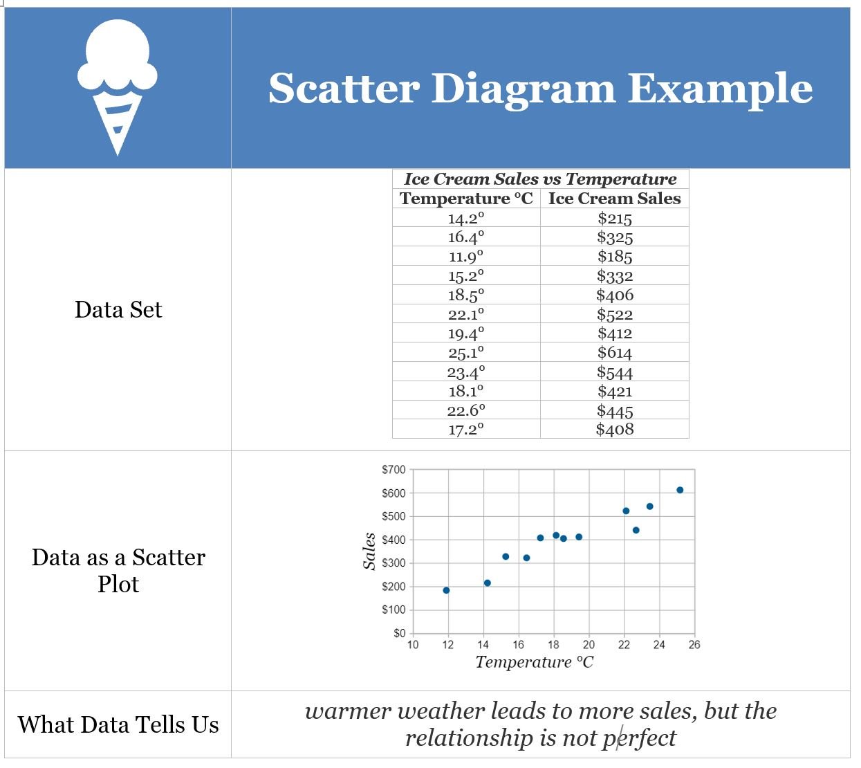
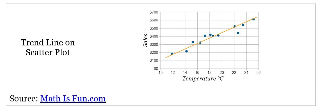
When considering scatter diagrams from the PMP exam perspective, the trend line can help the team see correlations between the data. As seen in the below business setting example, two sets of variables are measured over the same period, the data is plotted on the (X,Y) axis, andthen any potential relationship is examined.
Scatter Diagrams
When seeking to identify a correlation between two variables, the scatter diagram may be the best fit. It can “demonstrate a relationship between any element of a process, environment, or activity on one axis and a quality defect on the other axis.” Use the scatter diagram as a standalone tool or in conjunction with other quality tools to ensure decisions are data-driven.